With 2020 finally behind us, the year when e-commerce was never before as important to Australian breweries, take a look at four of the key packaging trends the industry can capitalise on to stand out in the new year.
by Shayne Tilley from 99designs
Breweries have long been admired as champions for experimentation – both in flavour and design. From eye-catching illustrations to bold typography, the industry never shies away from striking packaging.
The creative standard for breweries is consistently high but so is the competition. If you’re looking for ways to level up your visual brand in the New Year, tapping into some emerging trends is a sure fire way to stand out in the beer fridge.
When it comes to the packaging design trends set to take 2021 by storm, there’s a noticeable theme as designers predict a shift away from the traditionally commercial towards labels and cans that are a work of art in their own right. While craft brewers have long pioneered the art-inspired packaging movement, there are plenty of fresh themes and elements coming through as we head into a new year.
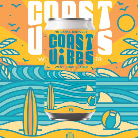
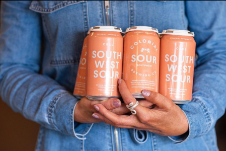
Product names front and center
Instead of the focal point being the brand name, logo or illustration, brewers are making the product name the star of the show.
With these designs, you can see what the product is called, and therefore what type of beer it might be, from a mile away. Perfect for brewers wanting to showcase their range of unique tastes to customers who might not be familiar with their brand yet. These types of design leverage strong typography that can carry the brand’s whole aesthetic. Any additional design elements are there to simply amplify this.
Mr. Banks Brewing Co let the product name do the talking on its Coast Vibes West Coast Lager, combining retro typography and wave-like illustrations to let you know this is a beer for crushing on the beach
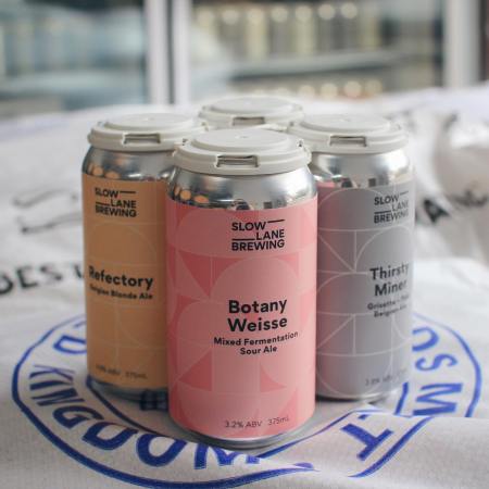
Hyper simplistic geometry
Another trend set to dominate beer packaging in 2021 is the use of simple, bold geometric concepts that tap into expressive colours, clear-cut angles and straight lines to create striking abstract label design.
Rather than use quirky illustrations or funky lettering to draw drinkers in, the simplicity does the hard work here, helping each product stand out and leave a lasting impression.
Slow Lane Brewing has adopted this design style across its entire range of old world European-style ales and lagers. Slow Lane’s website also features animated geometrical shapes and illustrations throughout as it extends the design right through all touch points of its brand, ensuring consistency and recognition.
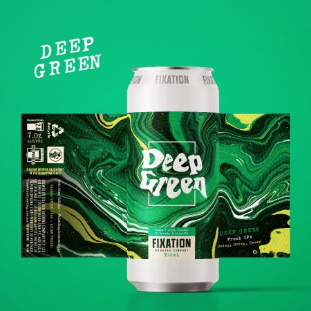
Packaging dressed as fine art
When a brewery truly nails their packaging, it can sometimes feel a shame to throw it in the recycling when all is said and drunk. Especially if the design feels like a work of art in itself.
Graphic design often takes cues from art movements and in 2021 we’re seeing beer labels being inspired by fine art techniques such as oil and resin paintings. While we have seen this trend gaining momentum mostly in high-end products to date, breweries are also starting to integrate designs that emulate the textures and effects often found on a canvas.
Fixation Brewing’s Deep Green Fresh IPA label looks like resin that has just been poured onto a canvas.
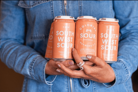
Solid, all-over colour
In 2021, also expect to see beer packaging designs that are choosing to forgo illustration in general and instead let the text and (often unconventional) color choices do all the talking.
Whether bright and loud, or more unusual moody shades, single blocks of colour work well to guide a buyer’s eye directly to the copy on the can. While undoubtedly a more understated trend, it is certainly a powerful way to ensure products stand out against busier designs.
Colonial Brewing has been leading this trend for a while now with its range of ales always contained in singular-colour cans.
While the quality of the beer is undoubtedly what keeps customers coming back for another sip, leveraging exceptional and creative design is crucial when it comes to connecting with customers, and enticing people to pick up a drink in the first place. At a time when people are staying at home more than usual, and may be more tempted to take a chance on something new, in many ways in 2021 the label on the outside will become almost as important as the beer on the inside (we did say almost!).