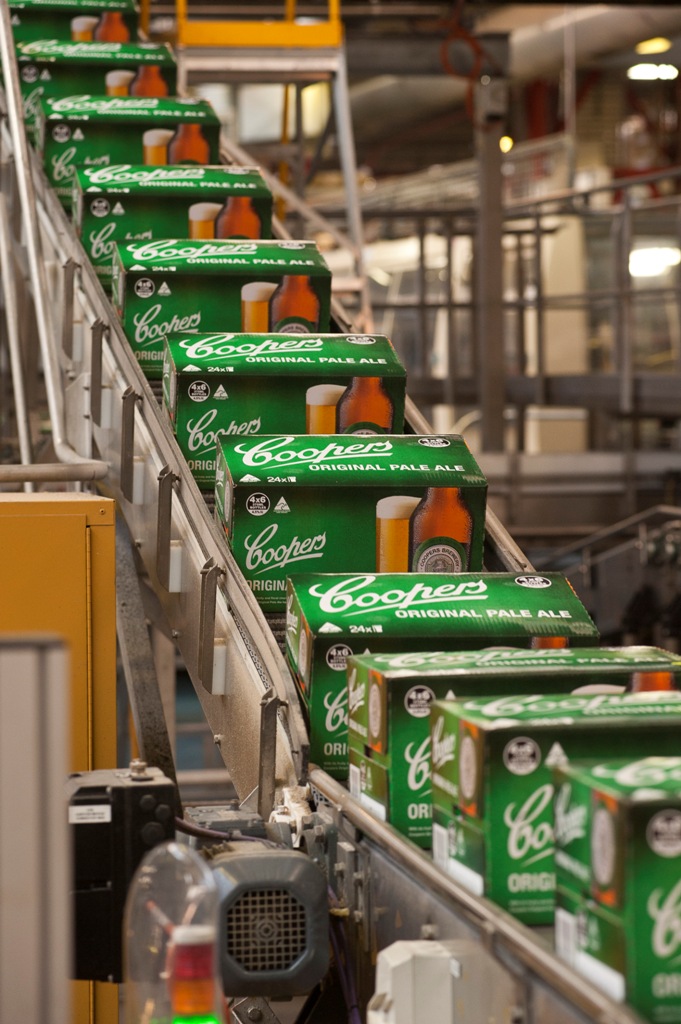
In a bold move, Coopers has decided to revamp its packaging to tie in with their anniversary. The new packaging is currently being rolled out across Australia, with Coopers hoping it will give their products greater visual impact in the marketplace.
Managing director Glen Cooper went on the record saying that Coopers were aiming to do with the new packaging was to “colour coordinate” their cartons and ale labels. That means that Coopers Original Pale Ale – know to all as simply Coopers Green – will now be packaged in bright green cartons, rather than the previously silver dominated boxes. Additionally, Sparkling Ale – or Coopers Red – will be enclosed in red, Mild Ale wrapped up ochre, Stout in yellow and Dark Ale in brown cartons. These colours new, brighter colours will also extend to the cluster packs inside each carton.
Mr Cooper was at pains to point out that that while the packaging was new, the product has most definitely not changed – an occasional unwanted connotation when revamping packaging in any industry. “Our customers can be assured that our beers remain unaltered,” he said. “The packaging changes are designed to make Coopers products more easily identifiable in liquor outlets and offer a fresh new look as we gear up for our next 150 years.”

All the bottles will also now feature special neck tags showing the Coopers 150th Anniversary logo, with the bottle caps to also mark the occasion.